I can’t lead with the picture in this blog (for reasons of this theme, not any other restriction…if I put the picture first, there’s a big blank. So…I will tell you a little bit about it before you see it. It’s not a scene from the book, exactly–they wanted it to be more SFnal and a starfield out the window helps with that. So…this is an image from Ky’s imagination, and probably from her past. What would it be like to wear *that* uniform? I’m happy with it. I hope you like it.
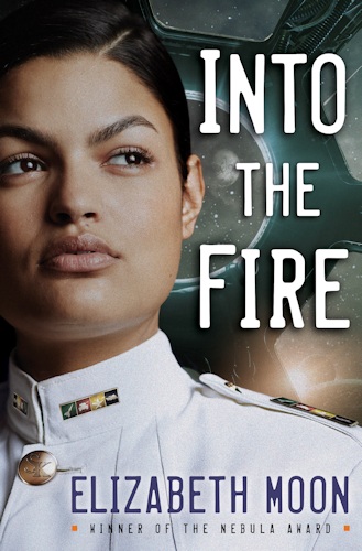
This is an advance view of the cover, by the way. Publisher won’t be putting it out until Friday, but I have permission to show it here first.
Meanwhile I’m working with the rewrite Editor wants. There’s a certain amount of rearrangement going on.
Hi – did you draw a cover? I really liked your Cold Welcome cover.
Not a bad cover.
Jonathan up in rainy NH>
Not this time, Jonathan. (So it’s raining and not snowing–doesn’t that mean Mud Season in NH?)
Very close to the Ky in my head, except the ears, the only place where the old covers influenced me was with the small ears.
SK on the button? Not a Spaceforce or planetary seal?
Slotter Key?
I like it. It looks like I think Ky looks.
I like it.
love it, love it, love it. And now for the book.
At least it looks more like the picture of Ky you showed us!
And here I thought the cover was a give away that she was back with “Fleet”. We’ll just have to wait and see.
“Her” fleet doesn’t have dress whites.
Love it I just got my copy of Cold Welcome in the mail today. I didn’t know you had revived the Vatta series I was so happy when I found out last week. Now I find you already have cover of book 2 done. I’m so excited, I’m saving your book to read on the beach in Florida next month.
So is that Serrano or Suiza or someone else?
That’s Ky Vatta.
An amazing cover! I admit I’ve been curious for a while if you had an exact idea of what the uniforms look like. Is there a chance you might release a quick run down of the colors and insignia of Ky’s Space Defense Uniform?
Glad you like the cover. Sorry, but right now my brain is stretched to its elastic limit with the revisions and the everyday…maybe another time.
Isn’t it obvious? That’s a badminton shuttle from her time in the academy team, a Ford Edsel that she did as an independent study restoration project, a star symbolizing her work as a stage hand for the freshman production of a Star is Born and a skein of yarn in white to symbolize 100 scarfs knitted. Works just like girl-scout badges.
🙂
Iphinome: Er…not *exactly*. But your explanation is funny, so I’ll refrain from solemnity.
Had to get my Kindle out to compare the two covers. Looks like the publisher used the same model for both. Into the Fire cover gives a better idea of skin tone.
Like them both.
Nadine: I’m honestly not sure, but if not the same then similar bone structure. I agree, the INTO THE FIRE cover shows her closer to her “real” color. Glad you like the new one.
I thought it would be a picture of Ky chopping vegetables with a big frying pan ready for crisping.
Maniacal laughter.
Jonathan up in NH where the weather has turned hot.
Jonathan: Ky is not…a great cook. Any kind of a cook in fact. I suppose she could chop vegetables, but she’s not trained in culinary arts. Except maybe cooking up trouble. (G) What do you call “hot” in New Hampshire?
Okay, classmate, how do I subscribe to your blog? So glad you’re still turning out your wonderful books–prefer the scifi over the fantasy, but both really well done.
Ye gods, are you THAT Monica Veal? Seriously? Wow. Long gap in our timelines. How to subscribe? I dunno. I just bookmark blogs I follow. (The whole “feeds” thing came along after my time–if it were up to me, I’d still be using DOS and writing in WordStar, probably, because I hate the loss of time it takes to install and learn the new stuff. Left to my own devices I’d spend all my time writing, photographing wildlife and native plants, learning music, and doing other stuff I really enjoy, learning the stuff *I* want to learn.)
The book is now listed on Amazon as a pre-sale with release date of February 6, 2018.
Congratulations
That’s an earlier date than they told me a month ago, and I’m not making fast progress on revisions, so it might be set back.
That is my daughter on both covers 🙂 She was proud to become Ky.
Love the book!
Was great seeing Ky come to life.
She is perfect for it! Tell her I said so!
I definitely will!